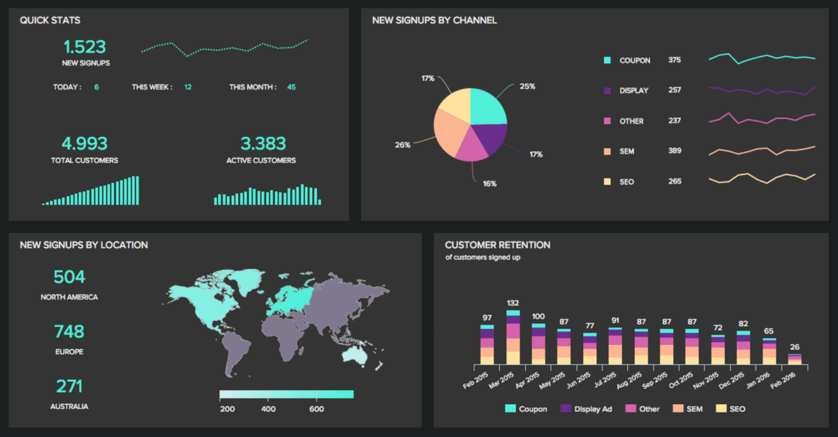
A con that can happen when posting an infographic online is that it can become hard to read if you have a lot of information on them and if you zoom in on it sometimes the images or text becomes blurry. There are steps you can take to make sure your infographic does not appear blurry when you zoom in but, unless you are computer savvy, the majority of people would not be able to figure it out. Another one can be that you have to use a legitimate source for all your information. You will have to provide links to your sources and have the ability to prove that they are quality sources.
Friday, April 26, 2019
Week 15- Pros Cons
Infographics can be very useful but they do have their pros and their cons. One pro that can come out of an infographic is that the infographic itself is easy to share. You can go anywhere on the web and see an infographic posted on almost any website or social media outlet you go on. Personally, all you have to do is save the infographic you created and then you have the ability to Tweet it out, put it on Facebook, or any other outlet. This is an easy way to get information out to the public or your friends. Another pro is that there is not any type of template that you have to follow when creating an infographic. They can be designed anyway your heart desires. The only thing that needs to be followed to an extent is that they are typically read from top to bottom or from left to right.
Thursday, April 18, 2019
Week 14 - Spacing
When making an infographic you are going to want to make sure you have enough spacing. Some people create graphics and they have so many elements that they are trying to get across that they run out of space, but continue to add different elements. If you have too much going on in your infographic it will be too much for the consumer's eye to comprehend and the point that you are trying to get across will not have the same impact. On the other hand, you do not want to have to much empty space because then it will look like you have not done enough research or put in enough effort.
Below is an example of my first infographic:
Below is an example of my first infographic:
Example of new infographic after receiving feedback from the old one:
I tried to have the spacing of the different elements be even, and I also added a different graph to show what is available to the recruits if they choose to go to Benedictine to play baseball. In the old infographic, I had just a chart showing the different velocities that were thrown. In the new infographic, I had a graph created showing all of the pitcher's average speed for a fastball. After showing the new infographic to my friends they also believed that the new one looked better, cleaner, and more simple.
Friday, April 12, 2019
Week 13- Project
For my final project, I decided to do an infographic for Benedictine Universities baseball team. I currently have an internship with them and I provide them with some analytical work for the pitchers to be evaluated. With my internship with the baseball team this spring I do analytical work and I am able to show what the pitchers do by providing percentages, pitch locations, and velocity charts. My thought process is that the infographic could be used to show recruits what the team has to offer, who they would be competing with and a little about what they are getting into. Also, have different charts displaying what style of pitch they are better at, an example being a “windup” stance or a “stretch” stance.
Based on who I have shown this infogrpahic to, they believe this just needs more. They think it is a good idea, shows what the team has to offer to the players. Benedictine, at least at the start of the year, is the first Division III school with an analytics team. Even though our resources are limited due to the budget, this being a new program, and being a Division III team, this can be used as a recruiting tool help get kids because of the advancements. The people that have seen this believe that I have the right idea, I just need to either change the colors to make it look more like school colors and also I could rearrange the graphics to make it more appealing to the eye.
Friday, April 5, 2019
Week 12 - Artificial Intelligence
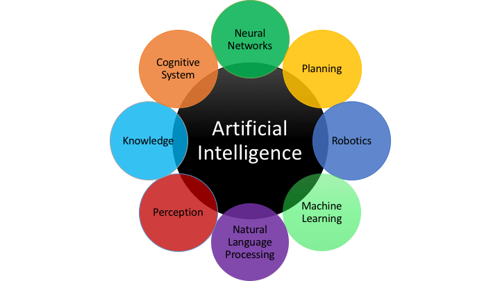
In the job hunt nowadays and also in the near future, it is going to be a necessity to keep up with all the technology changes. Courses that will help us prepare us for the future would be courses involving coding and computer science. Artificial Intelligence is becoming a more important part of this world and almost every industry uses some form of it to help benefit the business. Artificial Intelligence has the ability to take large sums of data that could take humans hours or days to figure out what it all means, and only take anywhere from than a minute to a few minutes.
The processing system can help speed the process of the rest of the business. This world is becoming more reliant on computers and if you fall too far behind the curve you could be setting your self up for failure. Artificial Intelligence has the ability to create many jobs with the advantages it presents to everyone. People have to have the ability to adapt to the changes and make their own lives better.
Saturday, March 30, 2019
Week 11 - Tableau
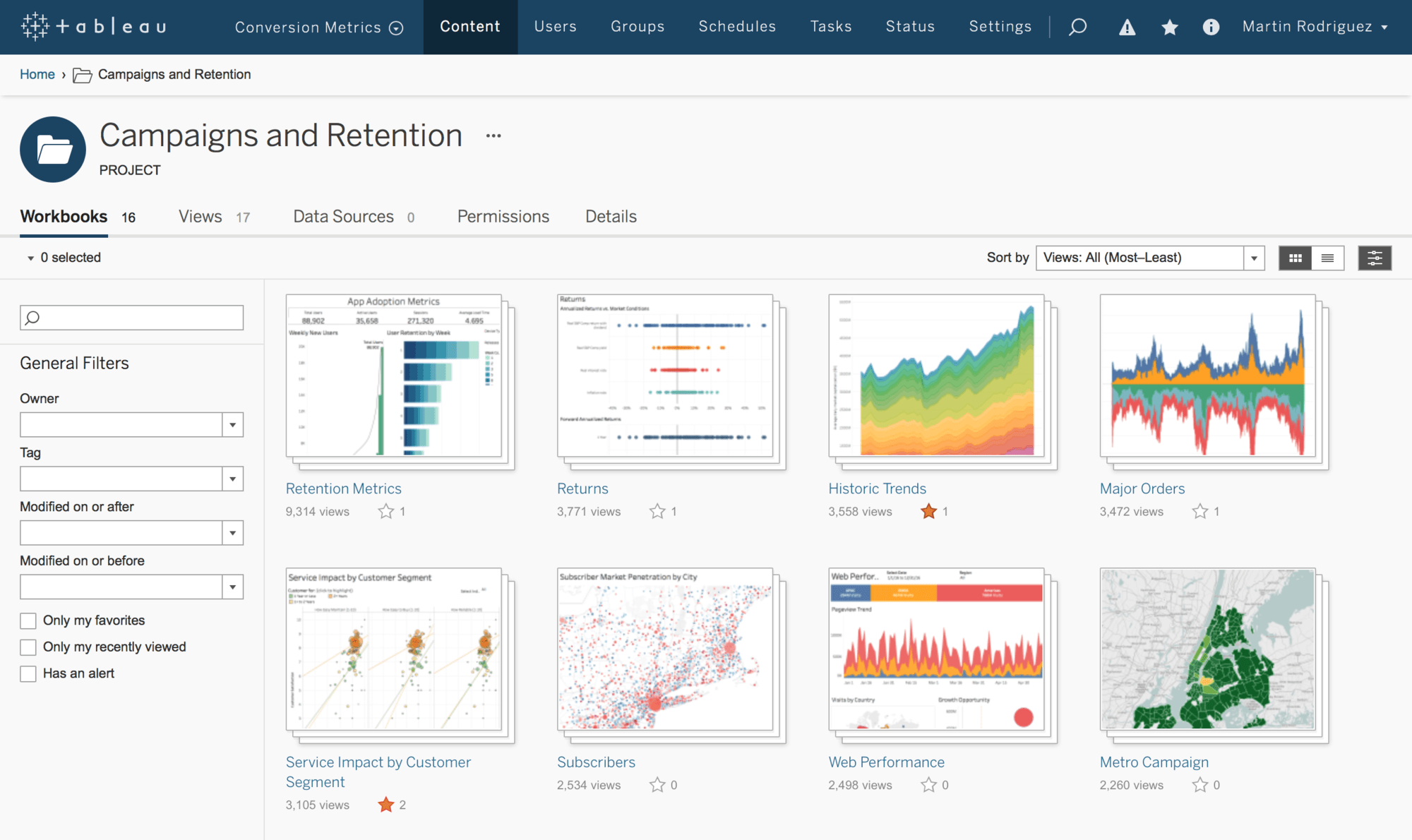
Tableau is a business intelligence software that helps people see and understand the data that they are looking at. It is meant to create a wide range of different visualizations to interactively present the data showcase insights. It has tools that allow you to drill down data and see the impact in a visual format that can be understood by anyone is an easy way. It also allows you to use real-time data analytic capabilities and cloud support. Tabeau has many different products including Tableau Desktop, Tableau Server, Tableau Online, Tableau Reader, and Tableau Public. Tableau Desktop is a business intelligence and data visualization tool that can be used by any individual. Its specialty is taking boring data and make it into eye-popping graphs. With the server, you can share dashboards that were created on the desktop. Tableau Online is a hosted version of the server. It is powered with some help of the cloud computing to make the software accessible to everyone. Tableau Reader is the free desktop version of Tableau. Tableau Public is another a free version of Tableau software that can be used by anyone to make visualizations.
A lot of people at first do not think there is a difference between Tableau and Excel. In Excel, you need to know what you are looking for and know the formulas. In Tableau, it will take you to insights you never thought would exist. Since you do not have to type in any formulas, you will be able to explore different data without anything specific in mind. This software is designed for business allowing them to find correlations in data without previous knowledge of data science.
A lot of people at first do not think there is a difference between Tableau and Excel. In Excel, you need to know what you are looking for and know the formulas. In Tableau, it will take you to insights you never thought would exist. Since you do not have to type in any formulas, you will be able to explore different data without anything specific in mind. This software is designed for business allowing them to find correlations in data without previous knowledge of data science.
Friday, March 15, 2019
Week 9 Infographics Client
The client that I will be doing for this infographic final project will be the Benedictine baseball team. The ideas I have come up for this project is to display how the pitchers perform. With my internship with them this spring I do analytical work and I am able to show what the pitchers do with percentages, pitch locations, and velocity charts. My thought process is that the infographic could be used to show recruits what the team has to offer, who they would be competing with and a little about what they are getting into. Also, have different charts displaying what style of pitch they are better at, an example being a “windup” stance or a “stretch” stance.
Friday, March 8, 2019
Week 8 Types of Graphs
As we have talked about all semester, using certain types of graphs are going to be key for your infographic. Different types of graphs are going to be better for different subjects and ways to visualize it. You are also going to want to make it clear what you are trying to get across to your audience. If you do not have the right graph to display your work, it can make it seem like it is unimportant and it can get looked over even if it is a major part of your infographic.
If you are trying to display a timeline of dates, a line graph would be the best. This is a good way to display a change in whatever your subject is over a span of time. You are going to want labels on the graph to show the months or the years in which you are talking about and then the numbers you are talking about whether that be money or number of whatever subject you are talking about.
If you are trying to display a timeline of dates, a line graph would be the best. This is a good way to display a change in whatever your subject is over a span of time. You are going to want labels on the graph to show the months or the years in which you are talking about and then the numbers you are talking about whether that be money or number of whatever subject you are talking about.
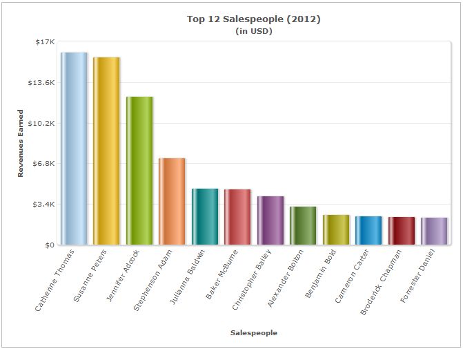
Another graph that is good to display differences would be a bar chart. A bar chart is good to show comparisons in different topics or track changes in a span of time. This is a way so people can see a change over time, or how different companies are performing at a certain time.
Client
My finalized client will be for the Benedictine Baseball team. Some ideas that I have come up with is to display how well the pitchers are doing and display the percentages of pitchers and locations of the pitches. This could be used as a recruiting tool to show recruits what they do in practice and in game.
Saturday, March 2, 2019
Week 7 Think Like Designer Balt 318
When putting together a
project of any kind, you have to have the ability to think like a designer to
an extent. You have to be able to attract the eye of your audience and direct
them in the right ways to help get your point across. In Knaflic's book she
talks about a few different main points when talking about how we should be
thinking when putting together an infographic. The first is affordances, which
is the inherent qualities in an object they would make it obvious how to use
it. If the audience doesn't know how to understand your inforgraphic then it
becomes pointless. The second is accessibility. The infographic that you create
has to be easily accessible for everyone and have the information simplified
for everyone. The last point is aesthetics. This is so you can grab the attention
of your audience so you can get your point across clearly.
In the article from wsj.com
they talked about how fast 5G was compared to 4G and 3G. When 4G first came
out, i thought it was a lot faster compared to 3G, and it was, but now seeing
the difference between 4G and 5G, it does not compare. In the graphic provided
by wsj.com, you were allowed to interact with it and click a button to watch in
real-time how fast 5G really is compared to 3G and 4G. This infogrpahic had all
three elements that Knaflic talked about, it was easy to use, was easily
accessible, and it was able to grab my attention.
Wednesday, February 20, 2019
Week 6 Focus Balt 318
With the last post being about how you don't want your infographic to be cluttered, this post will be about how to get the actual graphics to stand out. You will have to know what type of audience you are working with before hand so you have an idea how they think and how they will interpret the images. Even by using simple strategies like size, color, and the positioning of the image can make a difference in your point getting across. Using strategies like this can help direct your audience in the right way or to show what is important and what may not be as important. This technique would be like highlighting a quote in a book that you enjoy so it really pops out. The image below can be an example of preattentive attributes:
Image address
You will want to show your infographic in the best quality when you present it. You could share your infographic as a PDF to ensure that no quality will be lost when sending it to someone when being used into a presentation.
1. DBI Business Interiors located in Lansing, Michigan. They could potentially need infographics to help them display new products coming out. A person I could contact would be the assistant marketing director.
2. Benedictine University baseball. They may have the need of an infographic to show what they have done the past for recruiting purposes. A person I could contact would be the the pitching coach.
3. Benedictine University football. For the same reason as baseball, they may need an infographic that could possibly help them out with the recruiting process. A person I could contact would be the pass game coordinator.
Image address
You will want to show your infographic in the best quality when you present it. You could share your infographic as a PDF to ensure that no quality will be lost when sending it to someone when being used into a presentation.
Potential Clients
2. Benedictine University baseball. They may have the need of an infographic to show what they have done the past for recruiting purposes. A person I could contact would be the the pitching coach.
3. Benedictine University football. For the same reason as baseball, they may need an infographic that could possibly help them out with the recruiting process. A person I could contact would be the pass game coordinator.
Sunday, February 17, 2019
Week 5 BALT 318 Clutter
In my first infographic, I chose to do one on my predictions on what kind of music genres would be listened to most in 2019 in Illinois. This inforgraphic is simple and straight to the point. I believe it is easy to understand and shouldnt have to much probelm understanding what is going on. Depending how who you talk to, they may have different ideas on this subject and would predict different music.
After talking with some of my friends, I decided to make some changes to this last infographic to make it even better.
The new infrographic shows a better title to help describe what exactly is being shown and shows the top artsits that were listened to in the year prior, 2018. The one objective that stayed the same was the pie chart showing the percentages on what I believe will be the most listened to music. I chose to add the artists to show what the people listen to and use that to make a perdiction. Even though I did add graphics and words, I believe this one is better at what I am trying to get across.
Saturday, February 9, 2019
Week 4 Data Visualization
A TED Talk with David McCandless, he talks about having a solid balance between data visualization and how to have effective communication. With technology being so easy to access nowadays it is easy for most anyone to create a display and different software's to help them create them. If you talk to someone that is professional in creating displays, they would say it is not as simple as going online to create one randomly. You have to be able to connect to the people you are sharing the information with and make it easy for them to understand and comprehend. Using different types of visual techniques to help the eye be attracted to the information will make for a better display.
A system that a lot of people use and is very user-friendly is Microsoft Excel. you are able to create all kinds of different graphs to help display the information. You can edit the graphs to your liking with different colors, adding a table of contents, different graphics, etc. Finding different ways to display the content creatively is always a good idea to help get your point across to your business, customers, partners, etc.
A system that a lot of people use and is very user-friendly is Microsoft Excel. you are able to create all kinds of different graphs to help display the information. You can edit the graphs to your liking with different colors, adding a table of contents, different graphics, etc. Finding different ways to display the content creatively is always a good idea to help get your point across to your business, customers, partners, etc.
Thursday, January 31, 2019
Week 3 Importance of Context
In the video that was posted for week 3 on LinkedIn, it described a dashboard as a visual display that uses information that is most important to get the point across. In the video, it categorizes a dashboard into three different sections. The first being strategic. Under strategic it says it has a quick overview to monitor the health and opportunities of the business and focus in high-level measures of performance. An example of this is good and bad performance evaluations. Secondly is operational. Under operational, it says it is used for mainly monitoring operations and dynamic and immediate in nature. An example of this would be sales information. Then lastly, is analytical. Under analytical it says it requires additional context (comparisons, history, evaluations) and it is highly interactive.
While making a dashboard it can be sometimes easy to make mistakes. One way you can make a mistake according to the video was by fragmenting. This is when the person designing the dashboard creates a graph or multiple graphs that are distracting to the eye. Another mistake that can be made is when you put in more text then is needed so it takes up unnecessary space. The easier it is on the eye the better your point will get across
Subscribe to:
Comments (Atom)


