If you are trying to display a timeline of dates, a line graph would be the best. This is a good way to display a change in whatever your subject is over a span of time. You are going to want labels on the graph to show the months or the years in which you are talking about and then the numbers you are talking about whether that be money or number of whatever subject you are talking about.
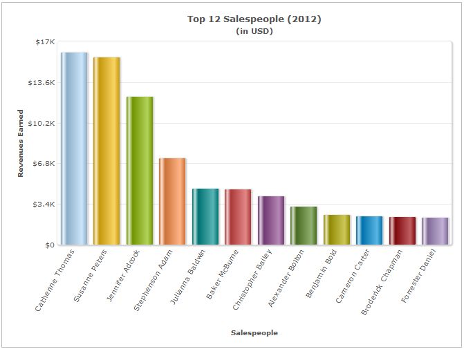
Another graph that is good to display differences would be a bar chart. A bar chart is good to show comparisons in different topics or track changes in a span of time. This is a way so people can see a change over time, or how different companies are performing at a certain time.
Client
My finalized client will be for the Benedictine Baseball team. Some ideas that I have come up with is to display how well the pitchers are doing and display the percentages of pitchers and locations of the pitches. This could be used as a recruiting tool to show recruits what they do in practice and in game.


No comments:
Post a Comment