Thursday, January 31, 2019
Week 3 Importance of Context
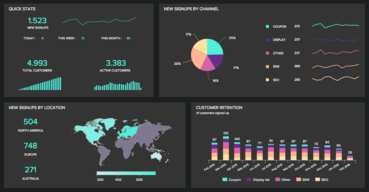
In the video that was posted for week 3 on LinkedIn, it described a dashboard as a visual display that uses information that is most important to get the point across. In the video, it categorizes a dashboard into three different sections. The first being strategic. Under strategic it says it has a quick overview to monitor the health and opportunities of the business and focus in high-level measures of performance. An example of this is good and bad performance evaluations. Secondly is operational. Under operational, it says it is used for mainly monitoring operations and dynamic and immediate in nature. An example of this would be sales information. Then lastly, is analytical. Under analytical it says it requires additional context (comparisons, history, evaluations) and it is highly interactive.
While making a dashboard it can be sometimes easy to make mistakes. One way you can make a mistake according to the video was by fragmenting. This is when the person designing the dashboard creates a graph or multiple graphs that are distracting to the eye. Another mistake that can be made is when you put in more text then is needed so it takes up unnecessary space. The easier it is on the eye the better your point will get across
Subscribe to:
Post Comments (Atom)

No comments:
Post a Comment