Saturday, March 2, 2019

Week 7 Think Like Designer Balt 318

When putting together a project of any kind, you have to have the ability to think like a designer to an extent. You have to be able to attract the eye of your audience and direct them in the right ways to help get your point across. In Knaflic's book she talks about a few different main points when talking about how we should be thinking when putting together an infographic. The first is affordances, which is the inherent qualities in an object they would make it obvious how to use it. If the audience doesn't know how to understand your inforgraphic then it becomes pointless. The second is accessibility. The infographic that you create has to be easily accessible for everyone and have the information simplified for everyone. The last point is aesthetics. This is so you can grab the attention of your audience so you can get your point across clearly. 


In the article from wsj.com they talked about how fast 5G was compared to 4G and 3G. When 4G first came out, i thought it was a lot faster compared to 3G, and it was, but now seeing the difference between 4G and 5G, it does not compare. In the graphic provided by wsj.com, you were allowed to interact with it and click a button to watch in real-time how fast 5G really is compared to 3G and 4G. This infogrpahic had all three elements that Knaflic talked about, it was easy to use, was easily accessible, and it was able to grab my attention. 

Wednesday, February 20, 2019

Week 6 Focus Balt 318

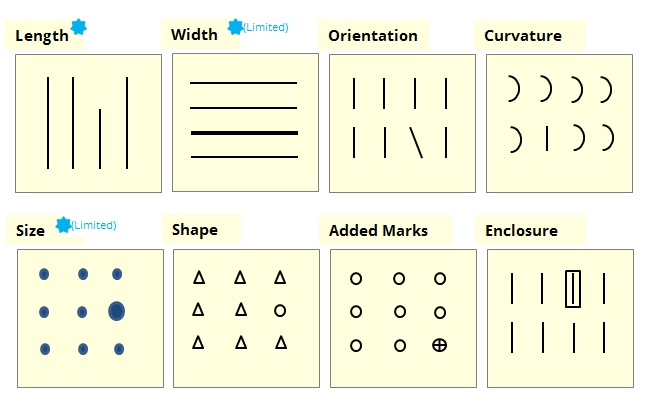
With the last post being about how you don't want your infographic to be cluttered, this post will be about how to get the actual graphics to stand out. You will have to know what type of audience you are working with before hand so you have an idea how they think and how they will interpret the images. Even by using simple strategies like size, color, and the positioning of the image can make a difference in your point getting across. Using strategies like this can help direct your audience in the right way or to show what is important and what may not be as important. This technique would be like highlighting a quote in a book that you enjoy so it really pops out. The image below can be an example of preattentive attributes:

Image address

You will want to show your infographic in the best quality when you present it. You could share your infographic as a PDF to ensure that no quality will be lost when sending it to someone when being used into a presentation.


Potential Clients 


1. DBI Business Interiors located in Lansing, Michigan. They could potentially need infographics to help them display new products coming out. A person I could contact would be the assistant marketing director.


2. Benedictine University baseball. They may have the need of an infographic to show what they have done the past for recruiting purposes. A person I could contact  would be the the pitching coach.


3. Benedictine University football. For the same reason as baseball, they may need an infographic that could possibly help them out with the recruiting process. A person I could contact would be the pass game coordinator.


Sunday, February 17, 2019

Week 5 BALT 318 Clutter


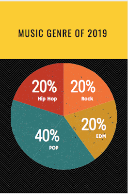
In my first infographic, I chose to do one on my predictions on what kind of music genres would be listened to most in 2019 in Illinois. This inforgraphic is simple and straight to the point. I believe it is easy to understand and shouldnt have to much probelm understanding what is going on. Depending how who you talk to, they may have different ideas on this subject and would predict different music.


After talking with some of my friends, I decided to make some changes to this last infographic to make it even better. 


The new infrographic shows a better title to help describe what exactly is being shown and shows the top artsits that were listened to in the year prior, 2018. The one objective that stayed the same was the pie chart showing the percentages on what I believe will be the most listened to music. I chose to add the artists to show what the people listen to and use that to make a perdiction. Even though I did add graphics and words, I believe this one is better at what I am trying to get across. 


Saturday, February 9, 2019

Week 4 Data Visualization

A TED Talk with David McCandless, he talks about having a solid balance between data visualization and how to have effective communication. With technology being so easy to access nowadays it is easy for most anyone to create a display and different software's to help them create them. If you talk to someone that is professional in creating displays, they would say it is not as simple as going online to create one randomly. You have to be able to connect to the people you are sharing the information with and make it easy for them to understand and comprehend. Using different types of visual techniques to help the eye be attracted to the information will make for a better display.

A system that a lot of people use and is very user-friendly is Microsoft Excel. you are able to create all kinds of different graphs to help display the information. You can edit the graphs to your liking with different colors, adding a table of contents, different graphics, etc. Finding different ways to display the content creatively is always a good idea to help get your point across to your business, customers, partners, etc.

Thursday, January 31, 2019

Week 3 Importance of Context

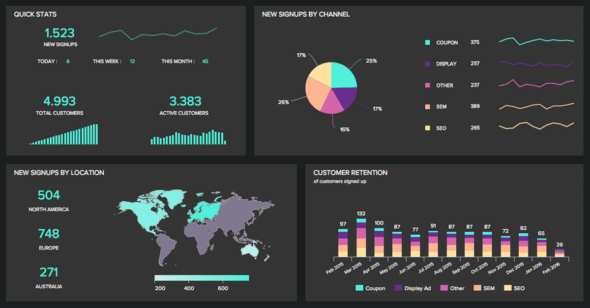
In the video that was posted for week 3 on LinkedIn, it described a dashboard as a visual display that uses information that is most important to get the point across. In the video, it categorizes a dashboard into three different sections. The first being strategic. Under strategic it says it has a quick overview to monitor the health and opportunities of the business and focus in high-level measures of performance. An example of this is good and bad performance evaluations. Secondly is operational. Under operational, it says it is used for mainly monitoring operations and dynamic and immediate in nature. An example of this would be sales information. Then lastly, is analytical. Under analytical it says it requires additional context (comparisons, history, evaluations) and it is highly interactive.


 While making a dashboard it can be sometimes easy to make mistakes. One way you can make a mistake according to the video was by fragmenting. This is when the person designing the dashboard creates a graph or multiple graphs that are distracting to the eye. Another mistake that can be made is when you put in more text then is needed so it takes up unnecessary space. The easier it is on the eye the better your point will get across

Sunday, January 27, 2019

Week 2 Canva

Canva can be used as a great editing tool. It is very easy to use for a first time user and you do not have to have any kind of special software knowledge to be able to create the infographic. They have many templates for you that are ready to go and all you have to do is edit it them to make the specific for you. While using the program, if you run into problems or do not know how to edit something, they have places you can go to help you through the problem you are having. The program is very user-friendly.


I chose to do my infographic on my predictions on what kind of music genres will be most listened to for the year 2019 in Illinois. There are many types of music. I projected that pop music would be the most listened to genre this year. I made this using one of the preloaded templates provided by Canva. The tool that I mainly used was the "text" tool.

Saturday, January 19, 2019

Week 1 BALT318 Sample Post

Hello!
My name is Grant Klaver and I am a senior at Benedictine University in Lisle Illinois. I am on pace to graduate in May of this year. I am a Business Analytics major and hope to use that to get a job somewhere in the sports world.


This blog is going to be used to talk about infographics. An infographic is a representation of information in a graphic form to make the information and data easier to understand.  These can be a way for businesses to tell a story in an easy way to co-workers or partners. There are many benefits for infographics that I will be discussing in this course.