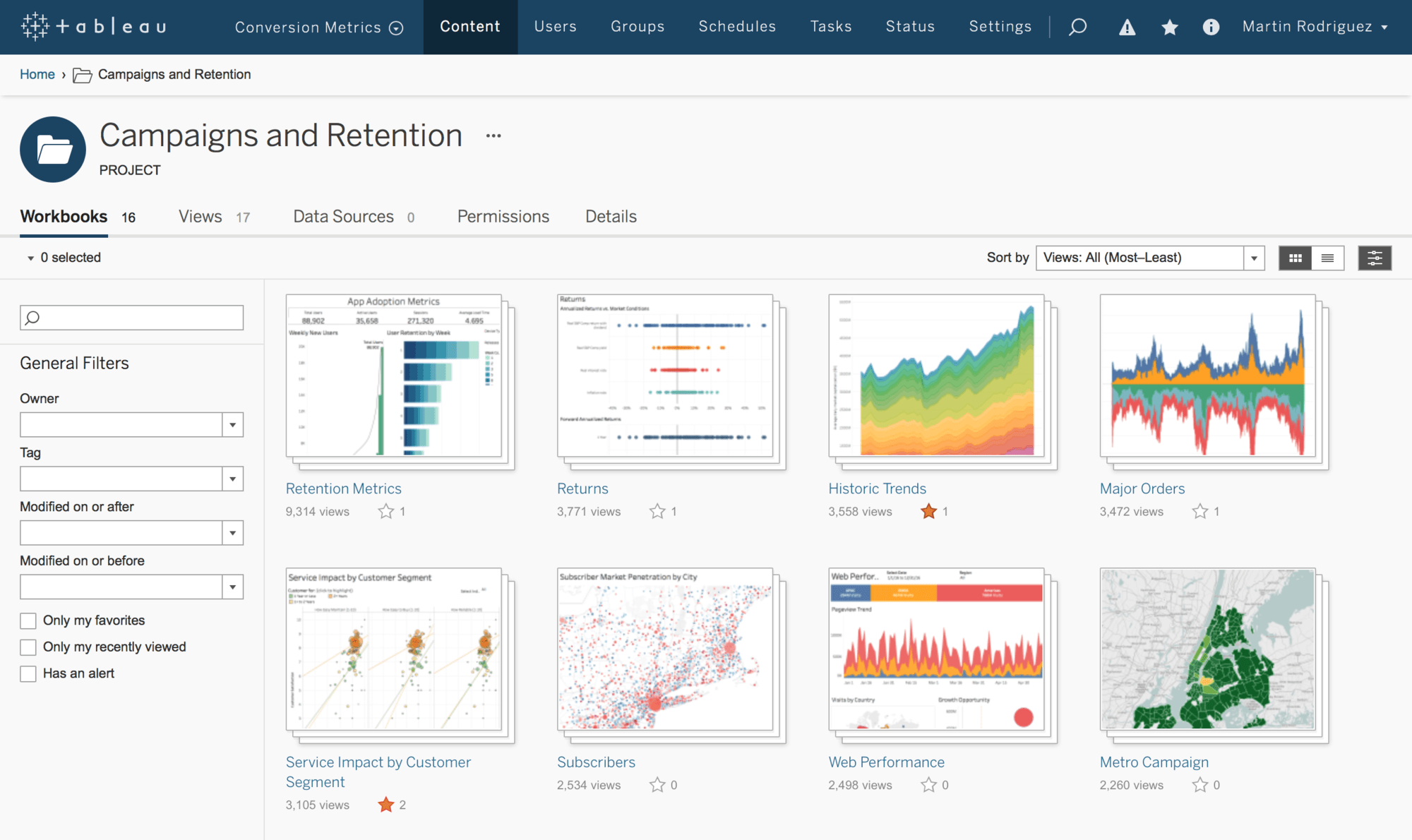
Tableau is a business intelligence software that helps people see and understand the data that they are looking at. It is meant to create a wide range of different visualizations to interactively present the data showcase insights. It has tools that allow you to drill down data and see the impact in a visual format that can be understood by anyone is an easy way. It also allows you to use real-time data analytic capabilities and cloud support. Tabeau has many different products including Tableau Desktop, Tableau Server, Tableau Online, Tableau Reader, and Tableau Public. Tableau Desktop is a business intelligence and data visualization tool that can be used by any individual. Its specialty is taking boring data and make it into eye-popping graphs. With the server, you can share dashboards that were created on the desktop. Tableau Online is a hosted version of the server. It is powered with some help of the cloud computing to make the software accessible to everyone. Tableau Reader is the free desktop version of Tableau. Tableau Public is another a free version of Tableau software that can be used by anyone to make visualizations.
A lot of people at first do not think there is a difference between Tableau and Excel. In Excel, you need to know what you are looking for and know the formulas. In Tableau, it will take you to insights you never thought would exist. Since you do not have to type in any formulas, you will be able to explore different data without anything specific in mind. This software is designed for business allowing them to find correlations in data without previous knowledge of data science.
Saturday, March 30, 2019
Friday, March 15, 2019
Week 9 Infographics Client
The client that I will be doing for this infographic final project will be the Benedictine baseball team. The ideas I have come up for this project is to display how the pitchers perform. With my internship with them this spring I do analytical work and I am able to show what the pitchers do with percentages, pitch locations, and velocity charts. My thought process is that the infographic could be used to show recruits what the team has to offer, who they would be competing with and a little about what they are getting into. Also, have different charts displaying what style of pitch they are better at, an example being a “windup” stance or a “stretch” stance.
Friday, March 8, 2019
Week 8 Types of Graphs
As we have talked about all semester, using certain types of graphs are going to be key for your infographic. Different types of graphs are going to be better for different subjects and ways to visualize it. You are also going to want to make it clear what you are trying to get across to your audience. If you do not have the right graph to display your work, it can make it seem like it is unimportant and it can get looked over even if it is a major part of your infographic.
If you are trying to display a timeline of dates, a line graph would be the best. This is a good way to display a change in whatever your subject is over a span of time. You are going to want labels on the graph to show the months or the years in which you are talking about and then the numbers you are talking about whether that be money or number of whatever subject you are talking about.
If you are trying to display a timeline of dates, a line graph would be the best. This is a good way to display a change in whatever your subject is over a span of time. You are going to want labels on the graph to show the months or the years in which you are talking about and then the numbers you are talking about whether that be money or number of whatever subject you are talking about.
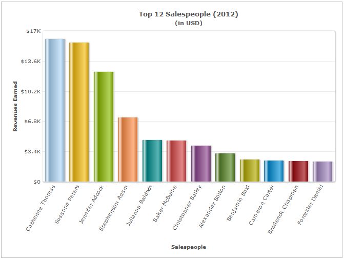
Another graph that is good to display differences would be a bar chart. A bar chart is good to show comparisons in different topics or track changes in a span of time. This is a way so people can see a change over time, or how different companies are performing at a certain time.
Client
My finalized client will be for the Benedictine Baseball team. Some ideas that I have come up with is to display how well the pitchers are doing and display the percentages of pitchers and locations of the pitches. This could be used as a recruiting tool to show recruits what they do in practice and in game.
Saturday, March 2, 2019
Week 7 Think Like Designer Balt 318
When putting together a
project of any kind, you have to have the ability to think like a designer to
an extent. You have to be able to attract the eye of your audience and direct
them in the right ways to help get your point across. In Knaflic's book she
talks about a few different main points when talking about how we should be
thinking when putting together an infographic. The first is affordances, which
is the inherent qualities in an object they would make it obvious how to use
it. If the audience doesn't know how to understand your inforgraphic then it
becomes pointless. The second is accessibility. The infographic that you create
has to be easily accessible for everyone and have the information simplified
for everyone. The last point is aesthetics. This is so you can grab the attention
of your audience so you can get your point across clearly.
In the article from wsj.com
they talked about how fast 5G was compared to 4G and 3G. When 4G first came
out, i thought it was a lot faster compared to 3G, and it was, but now seeing
the difference between 4G and 5G, it does not compare. In the graphic provided
by wsj.com, you were allowed to interact with it and click a button to watch in
real-time how fast 5G really is compared to 3G and 4G. This infogrpahic had all
three elements that Knaflic talked about, it was easy to use, was easily
accessible, and it was able to grab my attention.
Subscribe to:
Comments (Atom)


