Thursday, January 31, 2019
Week 3 Importance of Context
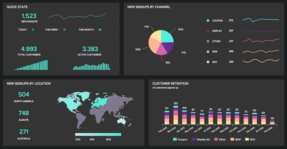
In the video that was posted for week 3 on LinkedIn, it described a dashboard as a visual display that uses information that is most important to get the point across. In the video, it categorizes a dashboard into three different sections. The first being strategic. Under strategic it says it has a quick overview to monitor the health and opportunities of the business and focus in high-level measures of performance. An example of this is good and bad performance evaluations. Secondly is operational. Under operational, it says it is used for mainly monitoring operations and dynamic and immediate in nature. An example of this would be sales information. Then lastly, is analytical. Under analytical it says it requires additional context (comparisons, history, evaluations) and it is highly interactive.
While making a dashboard it can be sometimes easy to make mistakes. One way you can make a mistake according to the video was by fragmenting. This is when the person designing the dashboard creates a graph or multiple graphs that are distracting to the eye. Another mistake that can be made is when you put in more text then is needed so it takes up unnecessary space. The easier it is on the eye the better your point will get across
Sunday, January 27, 2019
Week 2 Canva
Canva can be used as a great editing tool. It is very easy to use for a first time user and you do not have to have any kind of special software knowledge to be able to create the infographic. They have many templates for you that are ready to go and all you have to do is edit it them to make the specific for you. While using the program, if you run into problems or do not know how to edit something, they have places you can go to help you through the problem you are having. The program is very user-friendly.

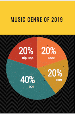
I chose to do my infographic on my predictions on what kind of music genres will be most listened to for the year 2019 in Illinois. There are many types of music. I projected that pop music would be the most listened to genre this year. I made this using one of the preloaded templates provided by Canva. The tool that I mainly used was the "text" tool.

I chose to do my infographic on my predictions on what kind of music genres will be most listened to for the year 2019 in Illinois. There are many types of music. I projected that pop music would be the most listened to genre this year. I made this using one of the preloaded templates provided by Canva. The tool that I mainly used was the "text" tool.
Saturday, January 19, 2019
Week 1 BALT318 Sample Post
Hello!
My name is Grant Klaver and I am a senior at Benedictine University in Lisle Illinois. I am on pace to graduate in May of this year. I am a Business Analytics major and hope to use that to get a job somewhere in the sports world.
This blog is going to be used to talk about infographics. An infographic is a representation of information in a graphic form to make the information and data easier to understand. These can be a way for businesses to tell a story in an easy way to co-workers or partners. There are many benefits for infographics that I will be discussing in this course.
Subscribe to:
Comments (Atom)
